Check out the video on YouTube or the audio on the podcast.
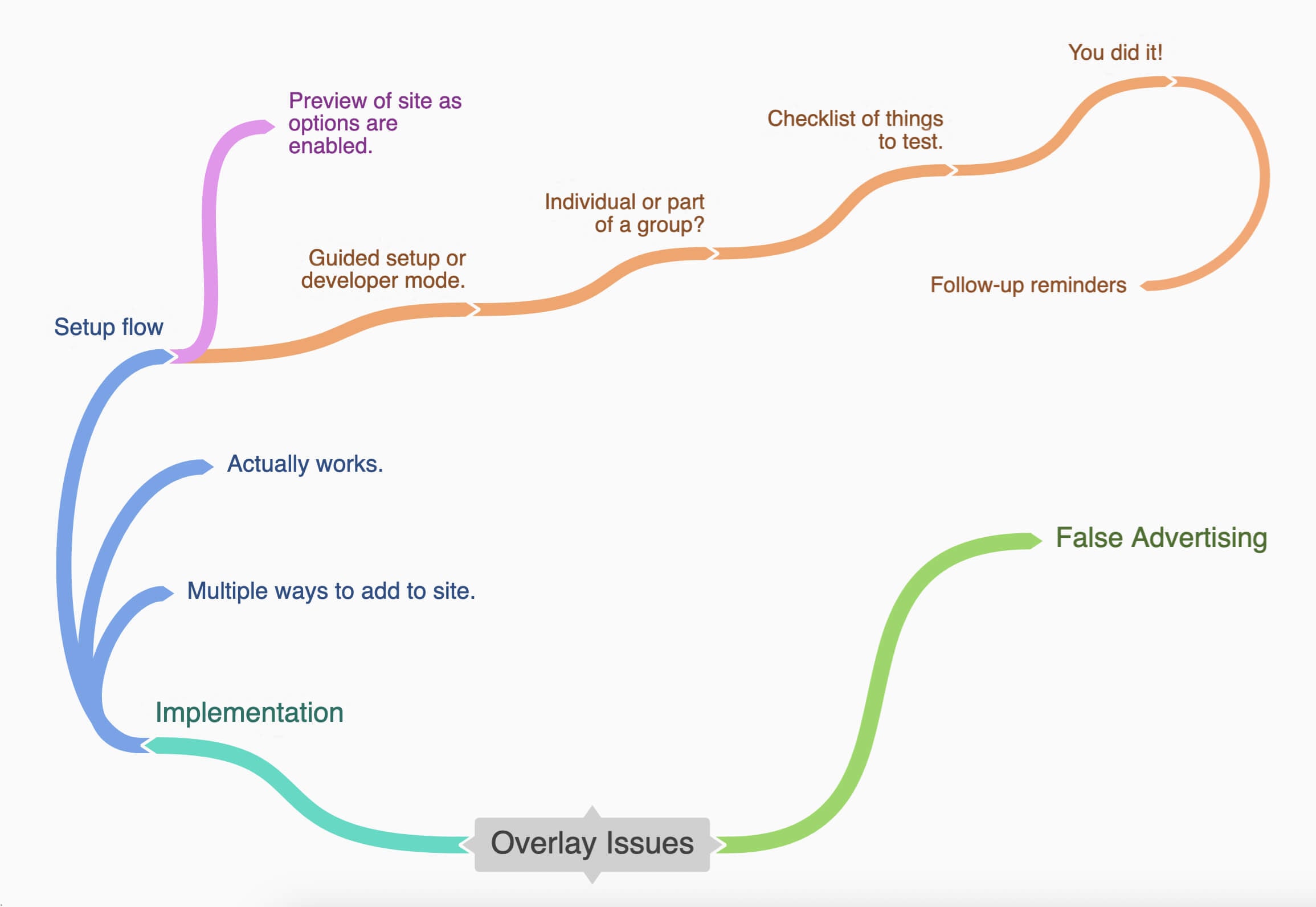
Here’s the full version of the flow chart.
I recently had a conversation with someone who was doing market research for a company that was looking to offer an accessibility overlay to their customers. And I actually thought I’d end up going into it being a whole lot more anti- everything about that idea.
But as I answered their questions, I found myself really discovering a new way to think about and to talk about these overlays. And since I’m not sure my thoughts will have the impact that I hope they will, I’m going to share them with you.
It boils down to two overarching problems with overlays.
The two problems
The first problem is that false advertising side. That’s the stuff that will hopefully continue to get addressed with the lawsuits. The overlay has to come from a place of wanting to help you offer some useful tools to your audience. It’s not about instantly making your site accessible or helping you helping to defend you from lawsuits.
So if we start from there, if we start from trying to help people put a light/dark mode or pause animations button on their site. Things that might be situational, something someone might want to change without having to change their browser settings. Or maybe it’s helping somebody that has a specific audience with a specific need like someone with an older demographic who wants to add a text resizer so that they’re not assuming that they just know how to zoom a page.
The other half of the issue is when these options that are available to website visitors don’t actually work. A lot of times these just don’t work properly or fully because we’re dealing with a ton of variables. There’s just no way to make sure that every setting works every time.
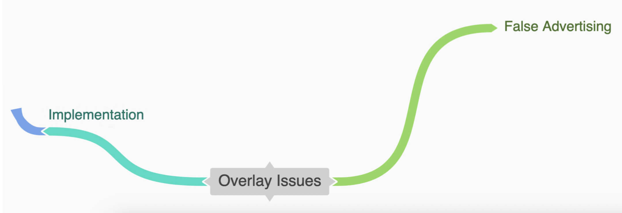
Addressing the issues
If we bypass that first issue completely by coming from a place of wanting to offer site options to people that they actually need without that false advertising. How can we help offer these things to people in a way that’s constructive, helpful, and actually works?
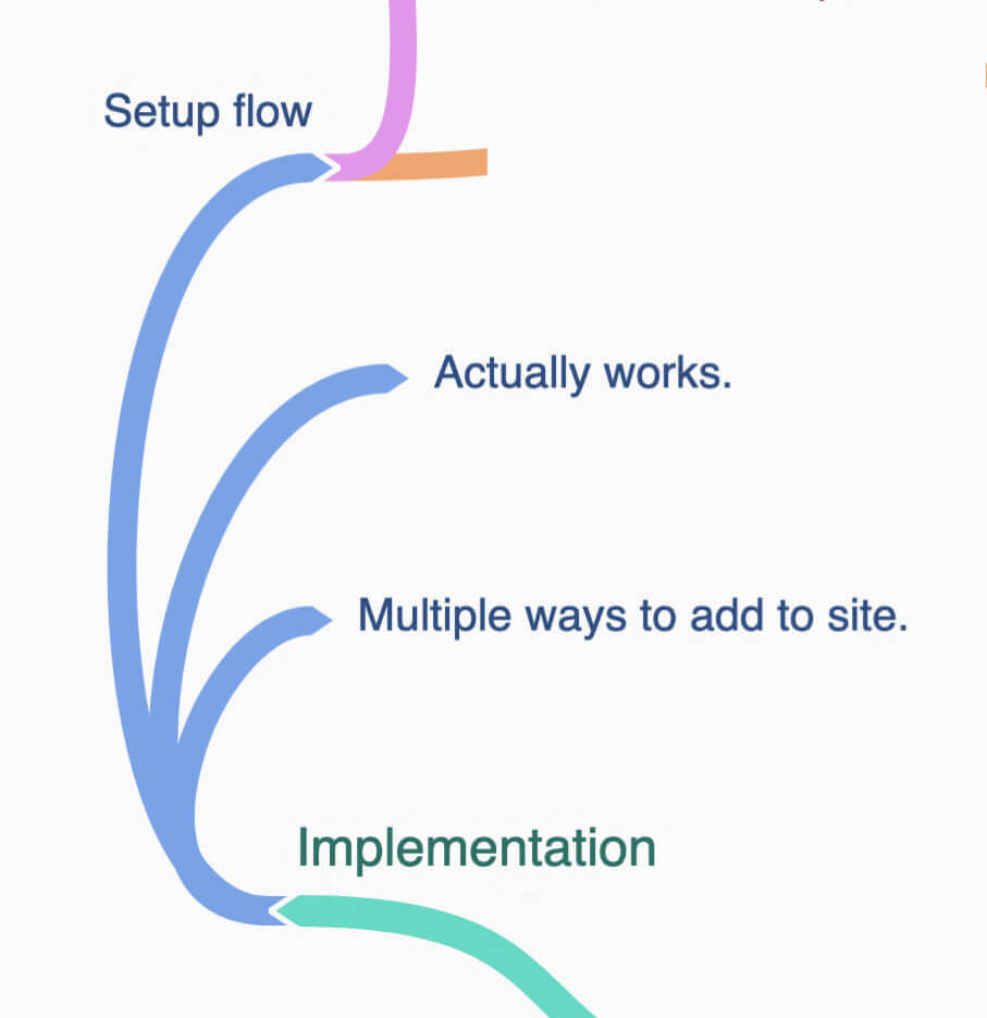
Adding it to the site
Don’t force people to put options exclusively in an overlay. Offer a standalone toggle or in a link that opens the options.
Is there a way to put it at the top of the page like my favorite type of cookie banner implementation? It’s dismissible, able to be returned to, and most importantly, accessible.
Guiding through the setup
Someone wants to offer a tool for their audience, they see the option to add it to their site, and the platform says, “Great, you did it.” There’s no understanding of what’s actually happening or that they need to you know test it or try it out in specific ways.
We need to guide people through some of this testing just like any other guided testing or checklist or remediation for accessibility issues.
Maybe we can have an actual preview of their real site while we’re checking these things to make sure they work with the site.
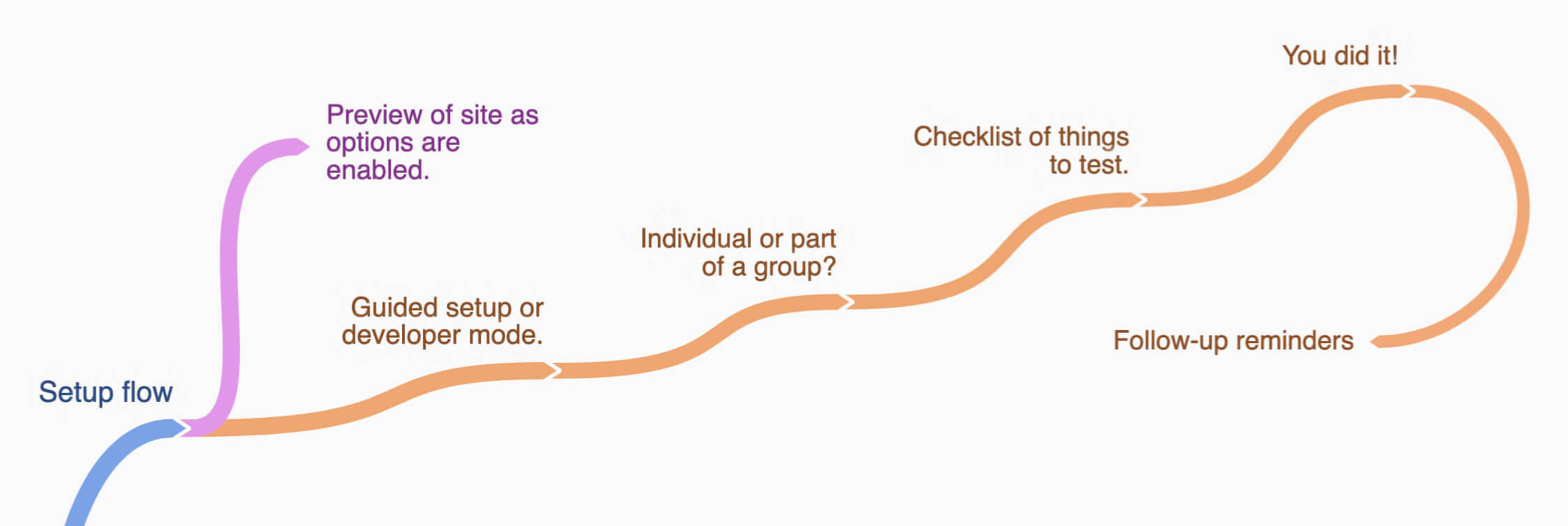
Step 1
It starts with not enabling every option by default. Not every site needs every option and not every option needs those granular controls. It’s information overload, distracting, and it’s not really necessary. We want to offer some simple tools to help navigate the site. We’re not an operating system.
We can ask a few questions about what’s on their site. I did this with my NEWT tool where you can choose what parts apply to your site and it’ll spit out some WCAG guidelines that align with those site features. There’s an “I’m a developer, I know what I’m doing” bypass, but let’s help them choose the best ones.
Step 2
Then we start asking them questions to guide them through the process. Do you want an individual widget to be able to add anywhere on your site or do you want it in a group of widgets?
Step 3
Then provide a short checklist of things that they need to do before they can finish. You have them actually check these things off.
Step 4
Then you say, “Congrats. Don’t forget to check it periodically or when things change or get added.”
We have their email and are reminding them every quarter or whatever frequency to check their site. We’re giving them resources for if it doesn’t work, maybe experts or tools or, you know, whatever. Remind them that fixing the problems they encounter with these tools will help everyone even if they weren’t going to use this tool.
Let’s make it happen
Most accessibility people aren’t saying the concept of providing these options for people is wrong. It’s just the implementation and the advertising. So what if we did these things in a way that considered the result? I want this to be a thing.
I want people to be able to offer their audience tools to make their time on their site more enjoyable. I want it to work for people who aren’t using a mouse. I don’t want a bunch of companies just white labeling the existing tools because they think they can make money selling it.
So, how can we make this happen? Please help me create this or take it and run with it yourself. Let’s do this. How do we do this?
