You did it. You got someone to want to reach out to you. They submit your form but forget to fill out a field or don’t input things correctly. If it’s not easy to find and fix those errors, people aren’t always going to seek you out somewhere else, if they even knew there was a submission issue in the first place.
Errors that are properly written and displayed are good for screen reader users, people with cognitive differences, and — as always — everyone else.
Check out the video on YouTube or the audio on the podcast.
Form setup & preventing errors
Put general instructions before the form. For example, if you use an asterisk to indicate something is required, you need to include a key at the top of the form stating that an asterisk means the field is required. You might also let someone know that all fields are required, or optional fields are indicated. Anything someone needs to know before filling out the form.
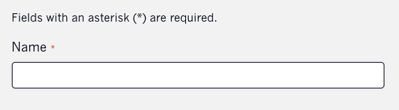
Tip: It’s best to use the actual word “required” next to the fields that are required, so use that method whenever possible.
Help Text
When you’re adding your fields, make sure to include some help text when you need to that shows the formatting requirement or describes what is needed.
Don’t overdo it. Not every field needs help text. But when you think it will help someone fill out the field and not have an error, that’s when you use it.
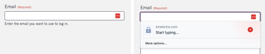
Help text placement
Help text should be placed above the field. When a browser or add-on suggest values to autofill, it would cover the help text if it was placed below.
Don’t hide help text behind a tooltip or a question mark to have to click on. They’re often not accessible, and someone might not think they need to read that help text and could miss some really helpful information.
Help text code
Help text should be programmatically associated with the input through aria-describedby, which your plugin or solution should be including.
<label for="input">What are the goals of your website?</label>

<div id="input_desc">Some examples would be leads, sales, brand awareness, and informational</div>

<textarea name="goals" id="input" aria-describedby="input_desc"></textarea>
Autocomplete
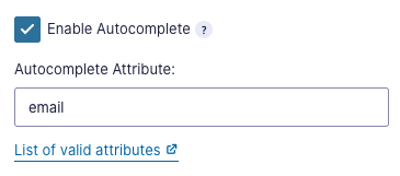
Utilize autocomplete input controls whenever you can as well. This lets the device suggest relevant values based on that information.
Best practices for preventing errors
Make sure you’re not making fields required when they don’t need to be.
For example, if you’re requiring a phone number, let people know in the description what the phone number will be used for. Some people may use different numbers for different reasons or be unable to talk on the phone. Is this something you can make optional instead?
The same goes for requiring things to be in a specific format. Is it important for syncing data that they input something in a specific format, or is it better to provide less friction and accept what they input in whatever format works for them?
Testing your form’s errors
Submit your form and make sure you know there will be an error. Your form should:
- Keep all the information you entered before, even if it was invalid.
- Move focus to the first field with an error or to the error summary.
- Have error messages under each incorrect field. The message should be specific to that field and provide suggestions for how to fix the error.
- Errors should remain until they’ve been fixed.
Sometimes you have the option to validate the field after you move on to the next field, but this is very hard to get right and can often be frustrating. (We’ll go into the pros and cons of this in a bit.)
Some additional tips:
- Your submit button should also not be disabled at any point, even if there are errors. You always want to allow someone to submit.
- If possible, include the error notification in the page title (the text that shows up in the tab of the browser).
- If you have more than a few fields with various requirements, that would be when you’d want to consider using error summaries.
Proper form errors
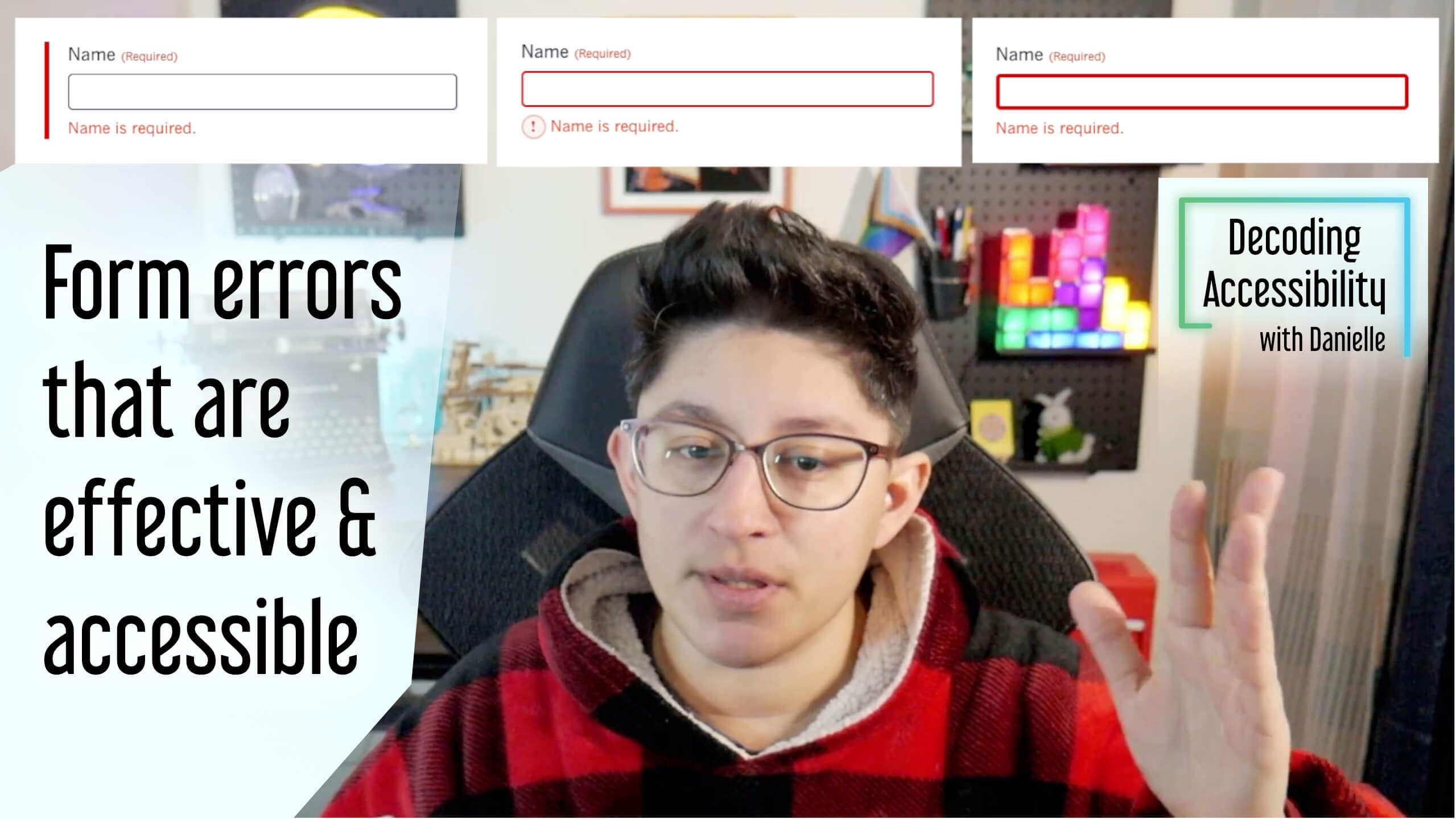
All of the font and color contrast requirements apply to errors. The color you use for error text needs proper contrast against the background, the border color needs proper contrast against the page and/or input background, and the font size should be readable.
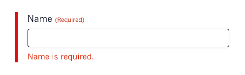
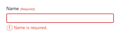
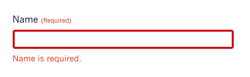
You’ll also need to make sure you’re styling fields that have errors differently. Adding the error message is a big part of indicating there’s an error, but you’ll also want to include something that helps the field stand out when scanning the form.
Some common ways to make errors stand out include icons next to the error message or adding a wide enough left border of the container of the label and input.
Writing the error message
Error messages should be short, specific to the field it’s referencing, easy to understand, and give proper suggestions whenever possible.
Instead of saying “This field is invalid,” say “Quantity should be greater than 100.”
If there’s a group of inputs related to the same thing (like first/last name or month/day/year), use a single error message.
The code for errors
Technically, we do have a way to use built-in browser methods for displaying errors. Unfortunately these built-in errors are not fully accessible or user friendly. So each form plugin or solution will have to create its own way to handle errors, which is where most of them run into their most significant issues.
Certain types of field requirements should be added to an input when it’s rendered, like aria-required, using the right input type, patterns, and using fieldset and legend for things like checkboxes and radio buttons.
Error messages should be programmatically connected to the field it’s referencing. You do this through aria-invalid and aria-describedby where appropriate. And if they’re using the “inline validation” method, those error messages need to be tested properly with assistive technologies to make sure they work properly.
<label for="input_email">Email <span class="required">(Required)</span></label>
<input name="your_email" id="input_email" type="email" value=""
    aria-required="true"
    aria-invalid="true"
    aria-describedby="validation_email"
    autocomplete="email">
<div id="validation_email">Please supply a valid email address</div>
You usually won’t be able to easily fix problems with this yourself, so make sure to reach out to them and be prepared to switch form solutions if they aren’t able to fix it.
The problem with “inline validation”
“Inline validation” can mean putting the error message near the field that has the error, which we mentioned earlier as a great way to show which fields have an error. But it can also mean showing an error as soon as someone is done filling out the input.
And so many people suggest this as a blanket way to make forms more accessible without providing any of the proper context or drawbacks.
It’s absolutely an option, but just like with everything else, it should be applied to those situations where it makes the most sense. Think of when you’re creating a new password. It might be useful to provide “strength meters” (whether they’re actually more secure is another issue). If the password has some kind of requirement like capital letters or special characters, notifying someone of that right away will prevent additional cognitive load and a better user experience. (Though again, the usefulness of this is questionable.)
But what if someone just wants to tab through a form to get a sense of what’s there? They’re going to trigger tons of unnecessary errors that are distracting and frustrating.
It can be helpful, though, to know what errors might be triggered without having to submit the form and then go all the way back through the form to fix them. And for really long forms, it’s important to include relevant headings, which would be an easier way for someone to navigate the form rather than tabbing through every field and triggering inline validation.
If you decide to use this method, you need to thoroughly test it across all types of technologies. Does it get read out to a screen reader? Does it only appear after someone tabs away? Is this something helpful for this particular form, or is it a distraction? Is usage consistent across all forms on your site?
Otherwise, just wait until someone has decided they’re ready to submit the form.
And whatever method you choose, definitely don’t start validating while is typing. It adds a ton of noise for screen readers, is distracting for visual users, and can be just plain frustrating.
WordPress form plugins & errors
For most WordPress form plugins, they consistently fall short in certain areas. Some of these issues can be avoided by not using certain field types, making sure to select the right options, and setting the right colors. The two areas you can’t fix easily on your own are the markup of each of the fields and how the form handles errors.
Of the two plugins that mention anything about the accessibility of their forms on their website, only one (Gravity Forms) offers error summaries. I asked the other one about it, and they said they would not be implementing error summaries because they’re already satisfying their accessibility requirement with inline errors.
Feel like something’s missing? Reach out! I’d love to make this the place to go to learn about form errors.
